
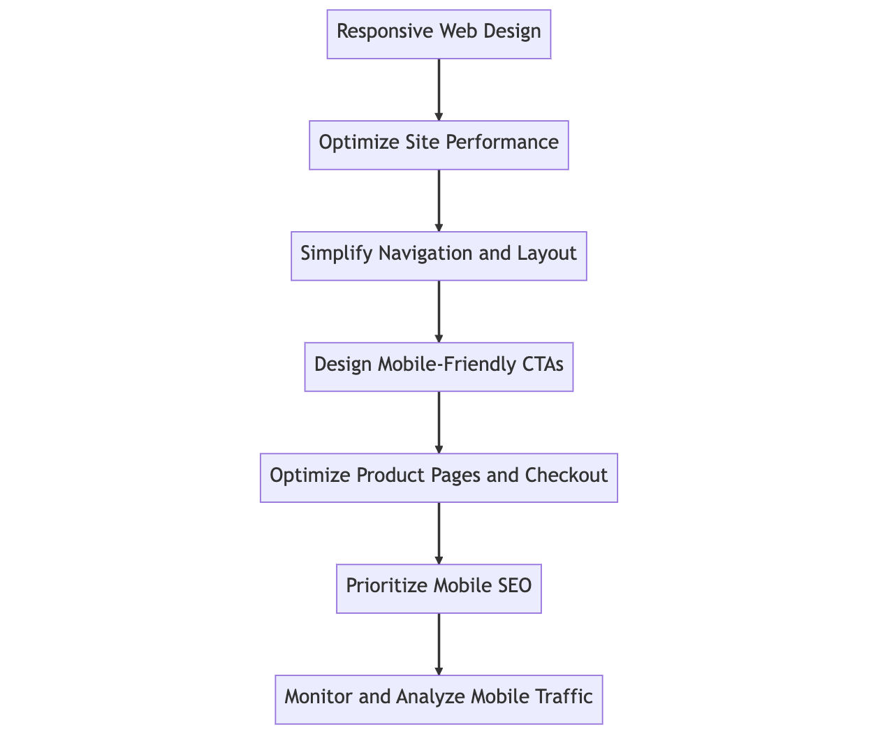
1. Implement Responsive Web Design
Responsive web design creates a seamless user experience across various devices. Responsive design adjusts the layout and content according to the screen size and device type by using flexible grids, images, and media queries.
Key benefits of responsive web design:
- Enhanced user experience
- Improved SEO performance
- Reduced bounce rate
- Increased conversion rates

2. Optimize Site Performance
A fast-loading website is essential for mobile users, as they expect quick and smooth browsing. To optimize your site's performance, consider the following actions:
- Compress images and reduce their file size
- Minify CSS, HTML, and JavaScript
- Implement caching
- Use a Content Delivery Network (CDN)
Test Tool: https://pagespeed.web.dev
3. Simplify Navigation and Layout
An intuitive and clutter-free layout will make navigating your eCommerce website easier for mobile users. Implement these design principles to simplify your site's navigation:
- Use a collapsible menu or hamburger icon for the main menu
- Include a search bar at the top of the page
- Limit the number of categories and subcategories
- Utilize clear and concise labels for menu items
4. Design Mobile-Friendly Calls-to-Action (CTAs)
To increase conversions, create mobile-friendly, highly visible CTAs that are easy to tap. Implement the following design practices:
- Use large, tappable buttons.
- Choose contrasting colors for CTA buttons.
- Place CTAs strategically throughout the page.
- Keep the CTA text clear and concise.
5. Optimize Product Pages and Checkout
Streamlining the user experience on product pages and during checkout can significantly improve your conversion rate. Consider these optimization tips:
- Display high-quality product images with zoom functionality.
- Provide detailed product descriptions and specifications.
- Allow guest checkout and social media login.
- Offer multiple payment and shipping options.
6. Prioritize Mobile SEO
To improve your eCommerce site's visibility on mobile search results, focus on mobile SEO strategies such as:
- Implementing a mobile-first content strategy
- Using schema markup for product pages
- Optimizing meta titles and descriptions for mobile
- Leveraging Accelerated Mobile Pages (AMP)
7. Monitor and Analyze Mobile Traffic
Regularly monitoring and analyzing your mobile traffic can help you identify areas for improvement and adjust your strategies accordingly. Use tools like Google Analytics to track key performance indicators (KPIs) such as:
- Mobile traffic sources
- Bounce rate and session duration
- Conversion rates and revenue
By implementing these seven essential strategies, you'll create a mobile-friendly eCommerce website that provides a seamless user experience, increasing visibility, conversions, and customer satisfaction.
Frequently Asked Questions about Mobile-Friendly eCommerce Websites.
Why is having a mobile-friendly eCommerce website essential?
How can I test if my eCommerce website is mobile-friendly?
How does responsive web design work?
What are the best practices for optimizing mobile site performance?
How can I simplify my eCommerce website's navigation and layout for mobile users?
What are some tips for designing mobile-friendly CTAs?
How can I optimize my eCommerce website's product pages and checkout process for mobile users?
How do I prioritize mobile SEO for my eCommerce website?
What tools can I use to monitor and analyze my mobile traffic?
We value your thoughts and insights on this topic, so please feel free to share your comments and ideas in the discussion box below. Your feedback helps us create better content and fosters a more engaging community. Let's discuss the best practices for mobile-friendly eCommerce websites and learn from each other's experiences. Don't hesitate to ask questions, share your own tips, or provide constructive criticism. We look forward to hearing from you!
https://cuonghoang.com/7-essential-strategies-for-making-your-ecommerce-website-mobile-friendly/?feed_id=366&_unique_id=643ca4643b150


Không có nhận xét nào:
Đăng nhận xét